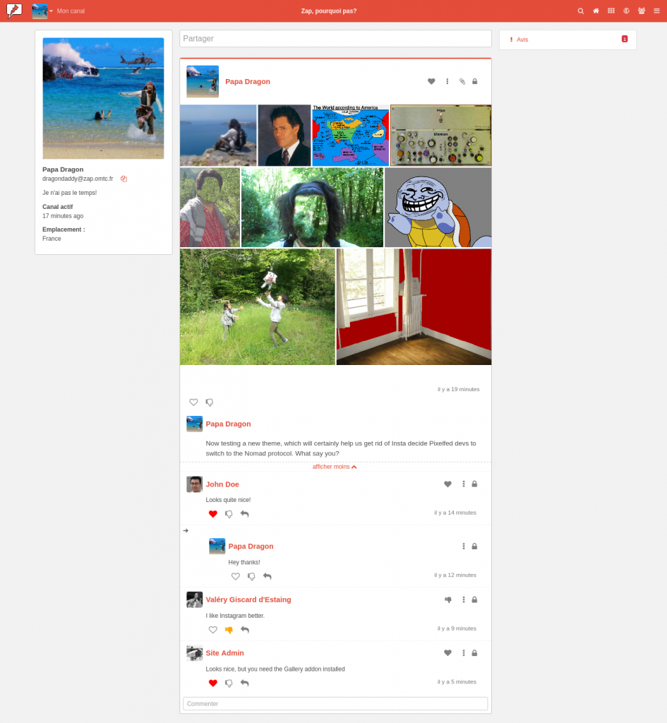
Hi people! I'm glad to show you a first screenshot of the theme I've been working on for a few weeks. Here's what it looks like:

Some parts may remind you Pixelfed or even Instagram. At least, I hope so.
For the moment it uses the Gallery addon available in Zap to get the tiled gallery. You need it to get this view, otherwise you'll get full sized pictures (I mean as wide as the main column). I'm not even sure that the tiling would actually work with sites that don't use the exact same theme. I'll do some more tests and keep updated those interested.
The main bugs/improvements I have spotted for the moment are the followwing:
- When writing the post, the preview doesn't work as intented as it looks quite different from the published post, I need to investigate this.
- There is a blank space below the tiled gallery, I haven't figured out how to make it disappear for the moment.
- The spaces between the icons are not regular while in the CSS file the margins are supposed to be exactly the same, I don't know if I'm missing something or if it needs hyprasubtle settings different for each icon.
- The Gallery addon could probably be replaced but, it seems awfully complicated to me. Using JS and/or pure CSS within the theme would not allow followers from other servers to obtain a tiled view, so it would have to be done differently, and I can't see how it could be done in a simple way.
Any thoughts?